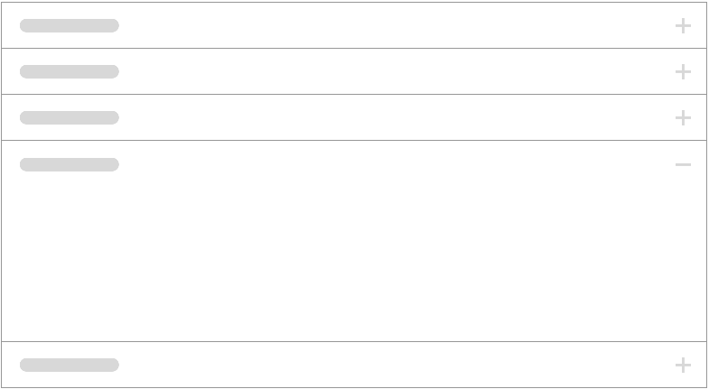
Accordion
A stack of drawers styled like Panels which show and hide content when the relevant header is clicked. Only one accordion is open at a time, the rest toggle closed when one is opened.
CSS Classes:
1. .accordion
- The component's container class. Houses the navigation and content for each accordion panel.
2. .accordion-navigation
- The accordion panel's title, and the clickable interaction that opens the accordion content.
3. .accordion-content
- The accordion content container, which contracts and expands when the accordion is toggled.
4. .accordion-indicator
- Icon should be
glyph="ic-add"when closed,glyph="ic-remove"when opened.
5. .is-open
- When accordion is opened, this class is appended to the
<article>,accordion-navigation, andaccordion-content.
The accordion directive builds on top of the collapse directive to provide a list of items, with collapsible bodies that are collapsed or expanded by clicking on the item's header.
We can control whether expanding an item will cause the other items to close, using the close-others attribute on accordion.
The body of each accordion group is transcluded in to the body of the collapsible element.
For more information, see Angular Foundation's Accordion docs.