Color Picker
Color Picker are used to select the color of an element (text, background color).
Subcomponents
Usage:
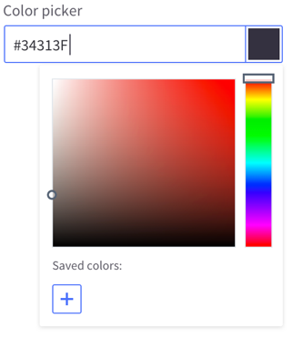
Color picker are always associated to an input. The value of the input will show the hexadecimal value of the color selected from the color picker, or the default value.
Clicking on any part of the input will open the color picker tooltip. Clicking on the color rectangle or outside of the input will close the color picker tooltip.
Users can add prefered colors by selecting the color first and then click on the + button. Saved colors can be deleted by selecting the color and then clicking on the delete icon.
Usage:
Color picker are always associated to an input. The value of the input will show the hexadecimal value of the color selected from the color picker, or the default value.
Clicking on any part of the input will open the color picker tooltip. Clicking on the color rectangle or outside of the input will close the color picker tooltip.
Users can add prefered colors by selecting the color first and then click on the + button. Saved colors can be deleted by selecting the color and then clicking on the delete icon.