Tabs
Tabs allows you to navigate between multiple documents in a single window. Instead of a single title bar, a tabbed window may include multiple tabs along the top. Clicking one of the tabs will display the contents of the corresponding document.
Standard Tabs
CSS Classes:
1. .tabs
- The parent element which wraps the tab navigation.
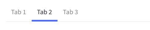
2. .tab
- The individual clickable tabs. The active tab will have the
.is-activestate class. - Must be assigned to
li, the childa.tab-titleshould have the[href]set to the ID of the tab's content.
3. .tabs-contents
- The parent element which wraps the tab component's contents.
4. .tab-content
- The individual panel which corresponds to each tab.
- This should contain
.is-active, and an ID for the tab to link to.
Headings can be set via the heading attribute or the tab-heading element in side the tab.
active sets the currently active tab.
select allows for an optional expression to be called when the tab is selected.
Accessibility
-
The
ul.tabsshould contain therole="tablist" -
The
a.tab-titleshould contain therole="tab", and be wrapped in ali.tabwith therole="presentation". It should also have anaria-controlsattribute which is the id of its tabpanel. -
If a tab is selected, the
role="tab"should havearia-selected="true"andtabindex="0", otherwise it should bearia-selected="false"withtabindex="-1". -
Each
div.tab-contentshould haverole="tabpanel", and should have anaria-labelledbyattribute which is the id of its correspondingrole="tab".