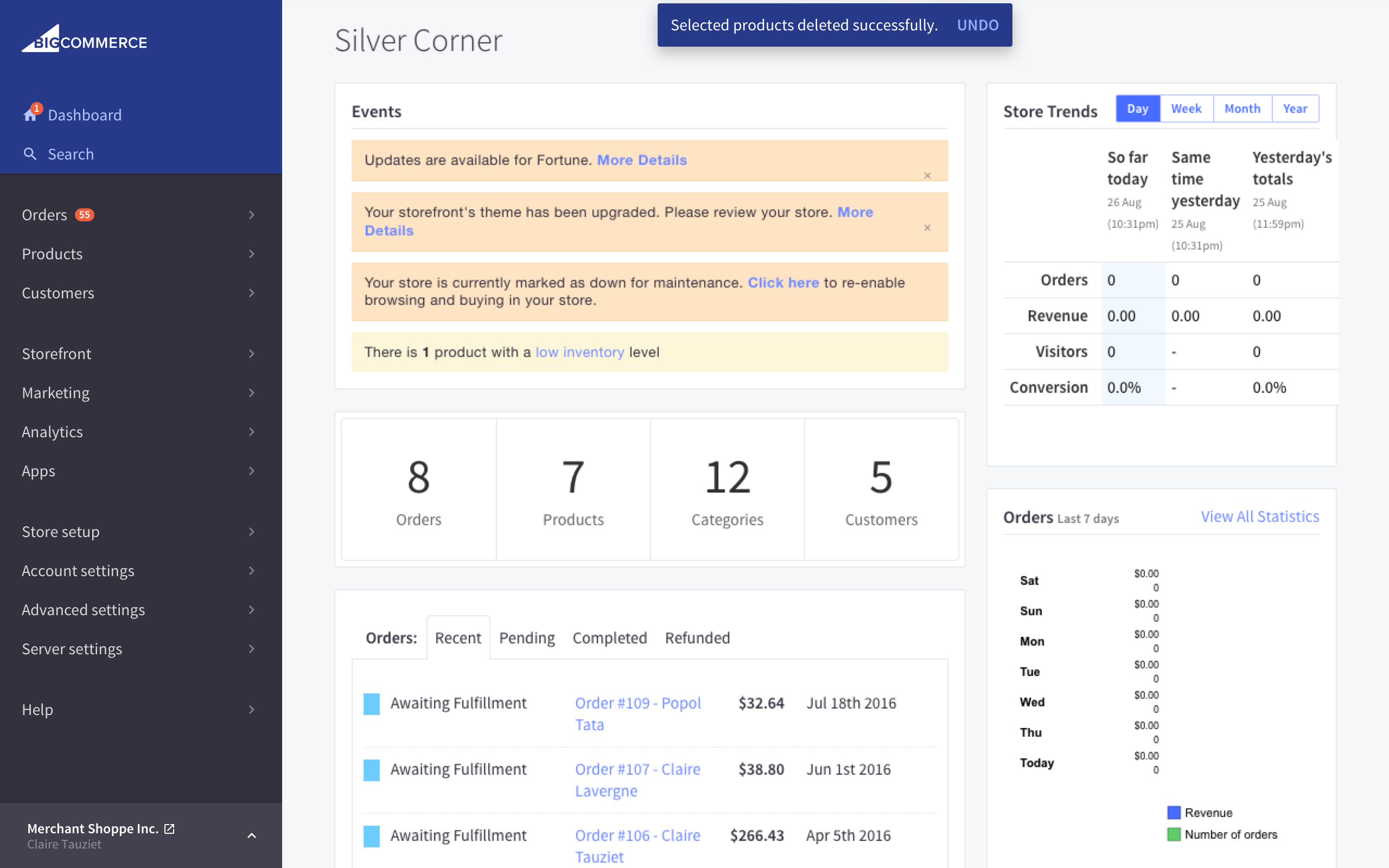
Toast
Success confirmation appears when user creates and completes a task successfully at the top of the page.
Usage:
- Success confirmation appears when user creates and completes a task successfully.
- Message will disappear automatically after 8 seconds.
- Message does not disappear on hover or focus. Timing starts again when the user hovers/focuses out.
- Message should be short and fit on 1 line (max 60 characters)
- 0 to 2 actions (if there are 2 actions, one will always be DISMISS).
The markup for the toast should be inserted somewhere near the top.
Usage:
1. [action] (optional)
- Adds an action link that will do a defined action set by the developer.
- Requires
[action-callback]to be inserted linked to an action implementation.
2. [dismiss-callback] (optional)
- Adds a dismiss link and will dismiss the global notification without waiting on timeout.
CSS Classes:
1. .globalMessage
- Container class for the global message's outer
divelement.
2. .globalMessage-column
- Divides global message content into sections.
- Vertically aligns content to middle.
3. .globalMessage-body
- Added to
globalMessage-columnwrapper. - Contains main body copy for global message (no longer than 60 characters).
3. .globalMessage-actions
- Added to
globalMessage-columnwrapper. - Contains any actions that the global message may require. Optional component.
4. .globalMessage-link
- Button or link that is added inside the
globalMessage-actionscomponent. - Max number of button/links that can be added is 2.