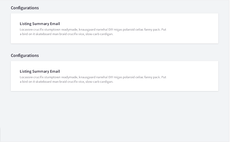
Panels
Panels display content of many or few elements that vary in both size and action. They are used to create structure and clearly delineate sections of content. Panels may contain photos, text, links, forms and buttons.

CSS Classes:
-
panel- The containing class for the panel component. Has no visual treatment.
-
panel-header- An optional section above the
panel-body. Contains thepanel-titleandpanel-title-description.
- An optional section above the
panel-body- The visually distinct container of the panel component. Should be able to handle any type of content
-
panel-title- An optional, specifically styled title for the panel. Using a
h2is recommended.
- An optional, specifically styled title for the panel. Using a
-
panel-title-description- An optional, specifically styled description for the panel under
panel-title. Panel title description has a max-width of 720px to ensure readability.
- An optional, specifically styled description for the panel under
-
panel-body-title- Heading that is inside the panel-body component. Using a
h3is recommended.
- Heading that is inside the panel-body component. Using a