Alerts
A message that pops up on your screen to warn you that your computer is about to perform an operation with potentially damaging consequences. It is a safeguard for users, preventing us from doing things we wish we hadn't.
Usage:
A notification is a message that appears within the control panel. They primarily elevate time sensitive or important information to the user.
Warning and Informational messages:- Messages are displayed under the page title (or tabs if tabs are) and will be providing messages concerning the page content (Can’t be inside a panel or a table - use other pattern for that)
- Can include 2 types of actions: Primary Action, Dismiss (always on the left of the primary action)
- Requires an action to be taken by the user to be able to run business correctly (business critical - use best judgment)
- Can’t be dismissed
- Used when we require people’s attention → need to take an action.
- Messages can be as long as we want but we recommend to keep them short (around 200 characters max)
- When dismiss, the message will not appear for the rest of the session.
- Inform users about something that will impact their experience with the page they are on.
- When dismissed, the message will never appear again
Usage:
1. <alert>
- Alerts can be used to inform users about the actions they perform. They can be displayed at a page level or inside a specific container.
2. type="alert.type"
Please use the appropriate level alert for the message. Not everything is an error.
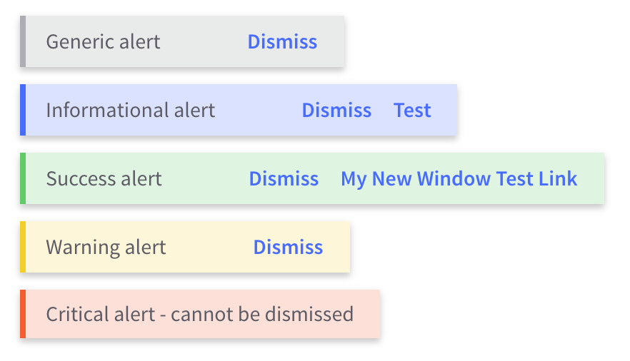
- type: 'success' - Green alert for success messages. It can have a link or dismiss button.
- type: 'warning' - Yellow alert for warning messages. It can have a link or dismiss button.
- type: 'info' - Blue alert for informative messages. It can have a link or dismiss button.
- type: 'error' - Red alert for critical messages. Users need to take an action so message is not dismissable.
3. links="alert.links"
Optional primary action link that can be provided. alert.links takes in the following arguments as an array:
- title: 'Primary Link Text'
- href: 'url'
- target: '_blank'
4. close="closeAlert($index)"
- When included, this property adds a Dismiss button to the alert message. For critical messages, a dismiss button should not be included since the user needs to complete an action.