Modals
Modals are the metaphorical post-it note to the interactive page. They take full focus and control from the app, and demand interaction or confirmation before returning control to the user.
Standard Modal
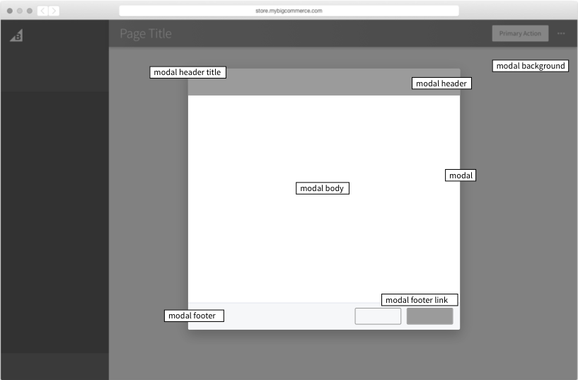
1. .modal-background
- Covers entire page, including navigation, with semi-transparent overlay.
- No actions – clicking on the
.modal-backgroundwill not close the modal. - The page behind the modal background is not scrollable.
- Fixed in height.
2. .modal
- Modals have a max height. Based on variation.
- Large modal - 640px
- Standard modal - 580px; Once content overflows, scrolling is enabled
- Small modal - has fluid height
- Height dependent on modifier class.
- When modal is visible, include
visibility: visible; display: blockstyles to enable the modal.
3. .is-active
- When the modal is visible, include is-active to
.modal-backgroundand.modal.
Modal Template: This markup forms the content of the modal and is not controlled by the directive.
1. .modal-header (optional)
- When content overflows, stays fixed to the top of the modal.
2. .modal-header-title
- If
.modal-headerexists, this must be provided as well. - Applied to
h2heading.
3. .modal-body
- Expanded by content. Scrolls for overflow.
- No limit to content – but be mindful of your users.
4. .modal-footer
- May have up to 2 actions, at least one which closes the modal.
- When content overflows, stays fixed to the bottom of the modal.
5. .modal-footer-link
- Must be used when the action for the modal is "Cancel". If it's not, you may use a
button--secondary. - Cancel button must trigger the modal to close.
The modal component is interfaced through the angular $modal
service. This service has only 1 method: get, which takes
an options object.
Options
1. templateUrl
A path to a template representing modal's content.
2. template
inline template representing the modal's content.
3. scope
a scope instance to be used for the modal's content (actually the $modal service is going to create a child scope of a provided scope). Defaults to $rootScope.
4. controller
a controller for a modal instance - it can initialize scope used by modal. Accepts the "controller-as" syntax, and can be injected with $modalInstance.
5. resolve
members that will be resolved and passed to the controller as locals; it is equivalent of the resolve property for AngularJS routes.
6. backdrop
controls presence of a backdrop. Allowed values: true (default), false (no backdrop), 'static' - backdrop is present but modal window is not closed when clicking outside of the modal window.
7. keyboard
indicates whether the dialog should be closable by hitting the ESC key, defaults to true.
8. windowClass
additional CSS class(es) to be added to a modal window template. Predefined class is modal--small.
Prompt
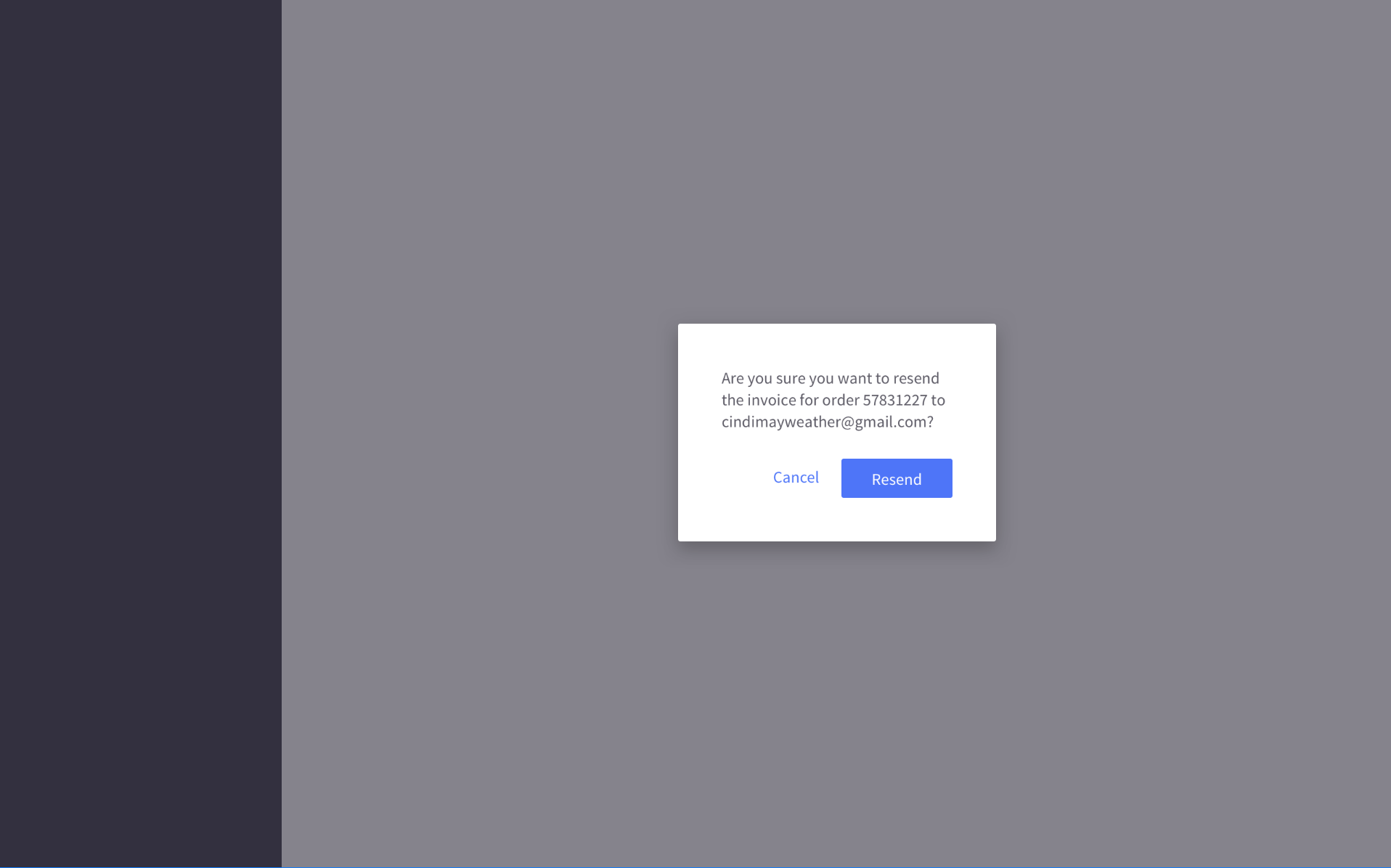
Usage:
Provide the user with one or more options to proceed.
Prompts behave like a modal in that it sits on top of a mask that obscures the rest of the UI.
Size the prompt at 292px width. The content inside the prompt determines the height.
The prompt does not have a header, and the footer is styled differently to our regular modal. The body does not scroll, so be mindful of the space you create with your content. Keep the text short and effective.
Classes
1.prompt
- Component class used for the prompt modal, as the modal's `windowClass`.
- Reduces the width of the entire
modal - Changes behaviour of height to be dependent on content
- Contains the same subcomponents as the Modal component, except the header and title.
2.prompt-footer
- Background color and borders are removed as part of the prompt pattern.
Extends the above modal sevice.
Options
1. windowClass
For prompts, defined class should be prompt.
Accessibility
As per its purpose and behaviour, the modal will trap all focus. This means that all tab indexing will cycle through the modal, and focus will immediately go to the first piece of readable content. This is either the modal header, or the content.
Accessibility Markup:
-
Modal has
role="dialog" -
When the modal is open, everything behind it has HTML attribute
aria-hidden="true", so assistive technology won't read out the underlying page. The best way to do this is to give the modal and the page separate wrapper elements and togglearia-hiddenon the main page's wrapper depending on whether or not the modal is open. -
Modal contains an HTML heading, either in
modal-header-titleormodal-content. -
Modal has an
aria-labelledbyattribute whose value is the id of the modal's heading
Keyboard interactions:
- Esc key closes the modal and moves focus to whatever triggered the modal to open.
- Tab key at bottom of modal cycles focus back to first focusable element at top of modal
- Shift+Tab keys at top of modal cycle focus back to last focusable element at bottom of modal
- Enter key submits modal's form data, if applicable