Components & Patterns
The building blocks of our pattern lab. The smallest piece of UI you can divide your patterns into, without abstracting it or turning it into plain content. Components do not necessarily have specific behaviours, or purpose, on their own.
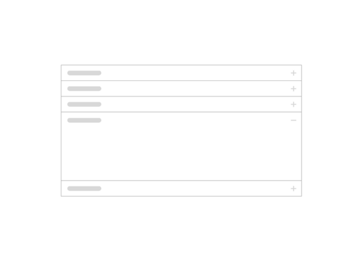
Accordion
A stack of drawers styled like Panels which show and hide content when the relevant header is clicked. Only one accordion is open at a time, the rest toggle closed when one is opened.
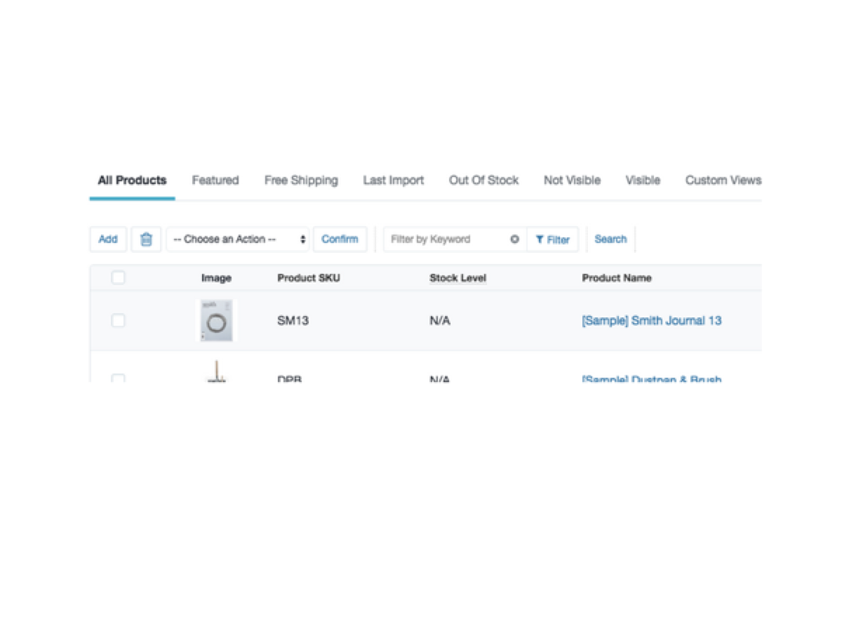
Action Bar
The Action Bar pattern is a form that sits on top of a visual dataset; like a data table or a grid of product cards, for example. It modifies its dataset on submission. Common actions include filtering, searching and paginating.
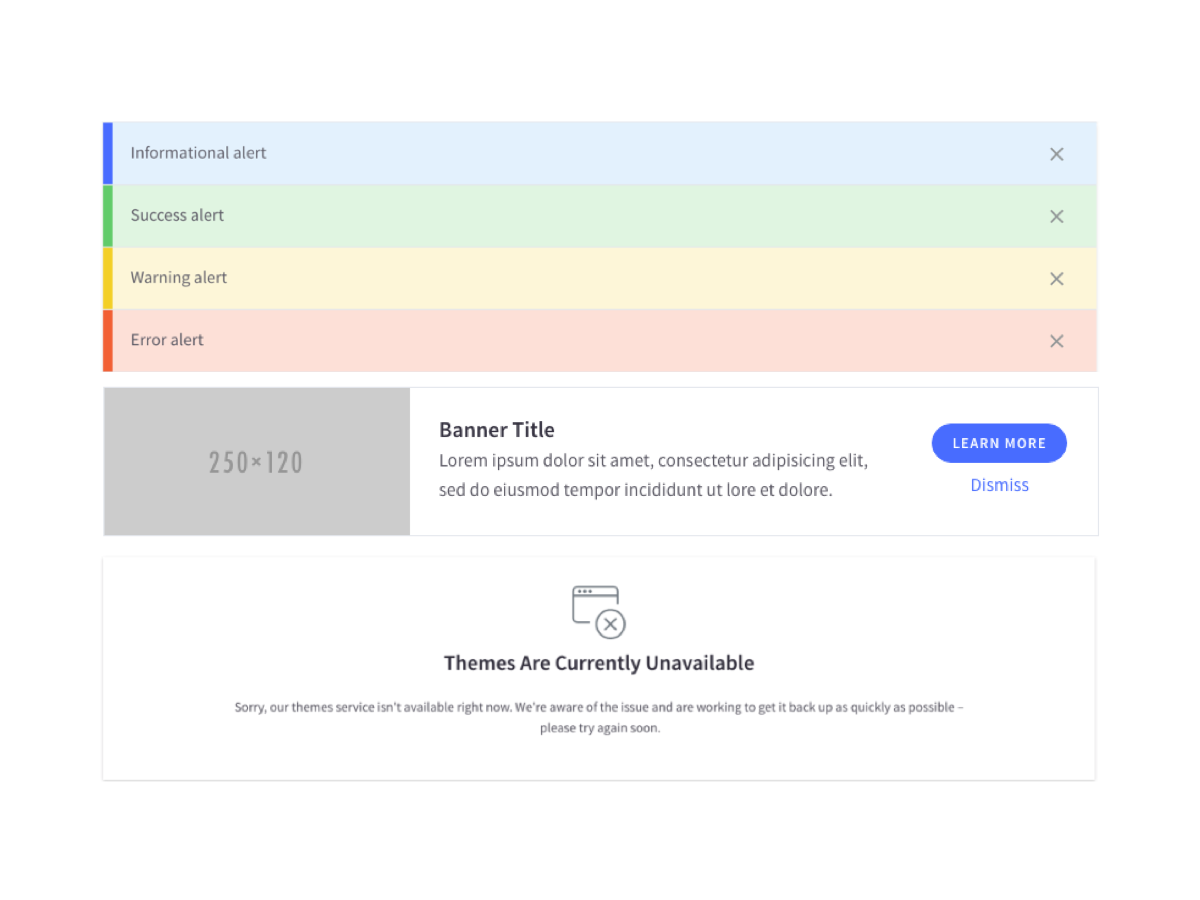
Alerts
A message that pops up on your screen to warn you that your computer is about to perform an operation with potentially damaging consequences. It is a safeguard for users, preventing us from doing things we wish we hadn't.

Banners
Banners are used to notify the user of a contextually relevant piece of information or event.
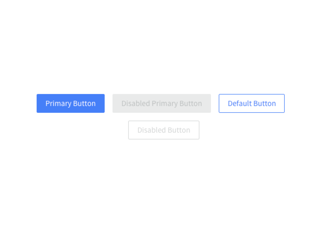
Buttons
The basic button component. Used for basic interactions with applications; sometimes used to style links when the resulting action is to navigate to another page.
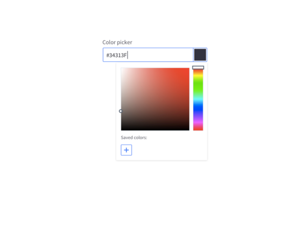
Color Picker
Color Picker are used to select the color of an element (text, background color).
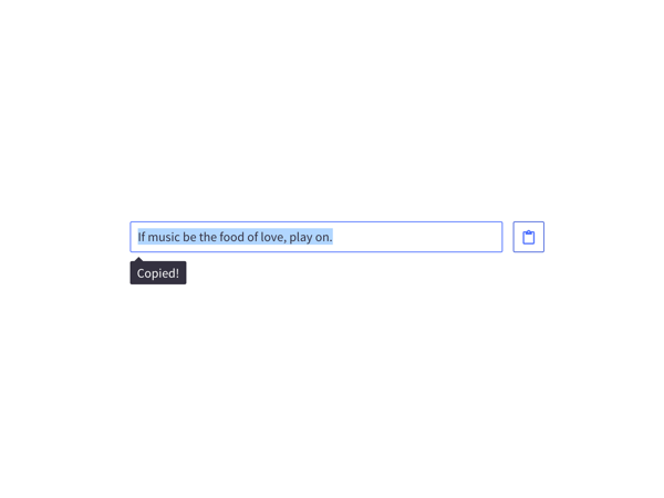
Copy to Clipboard
Copy text to clipboard without using flash.
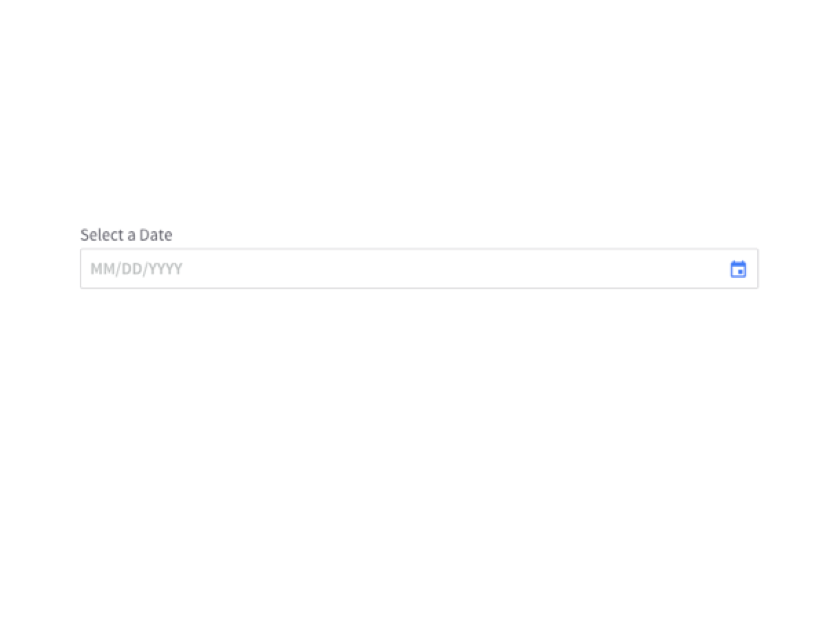
Date Picker
Allows the user to select a date from a calendar format as an alternative to manual input.
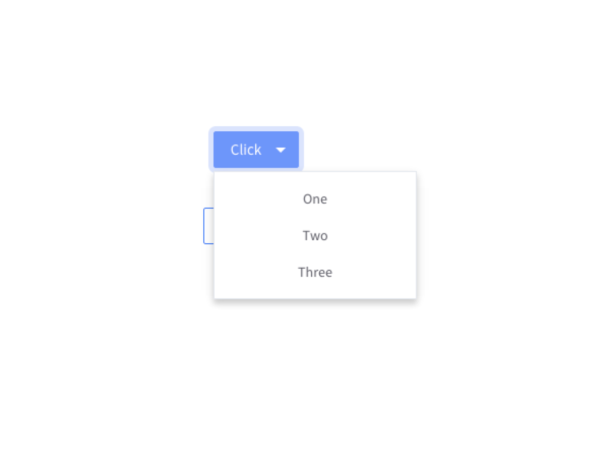
Dropdowns
Dropdowns are used to group actions and options for making selections. A dropdown can take the form of a select, button or an icon (ex. More Icon, Arrow).
Error Messaging
Allows the user to select a date from a calendar format as an alternative to manual input.
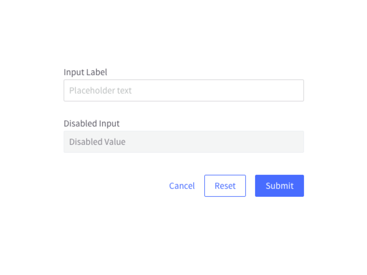
Forms
The structure and states for the various form elements used in the BigCommerce Pattern Lab and applications.

Loading States
A program that is loaded may itself contain components that are not initially loaded into main storage, but can be loaded if and when their logic is needed. Once loading state is triggered, a symbol is usually shown as a feedback to the user.
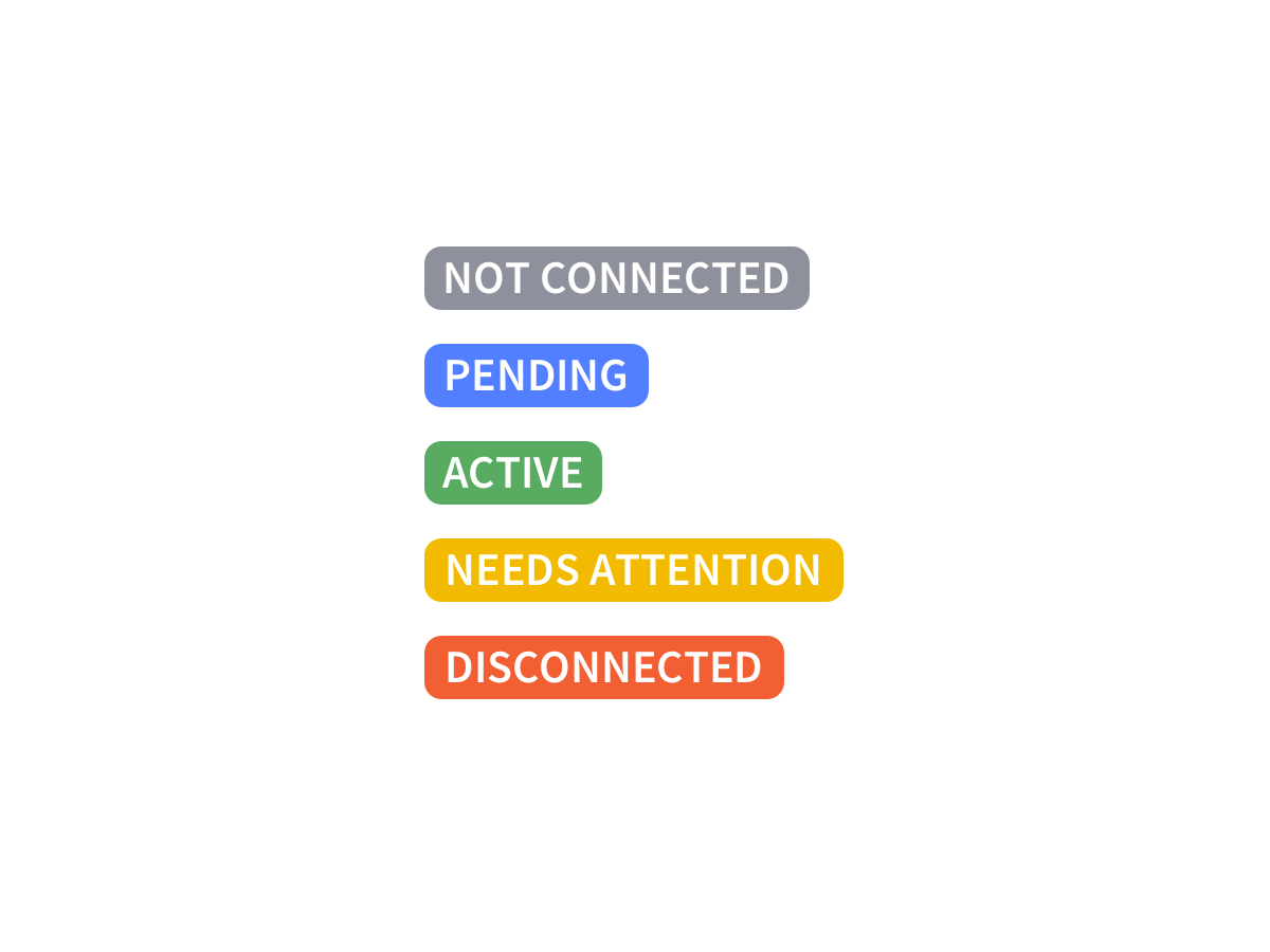
Lozenges
Lozenges are used to inform the user/merchant of a value or status (based on a list of values) applied to an element. These status range from positive to negative and, most importantly, inform the user if there is an error or action needed.
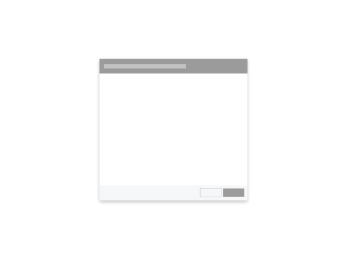
Modals
Modals are the metaphorical post-it note to the interactive page. They take full focus and control from the app, and demand interaction or confirmation before returning control to the user.
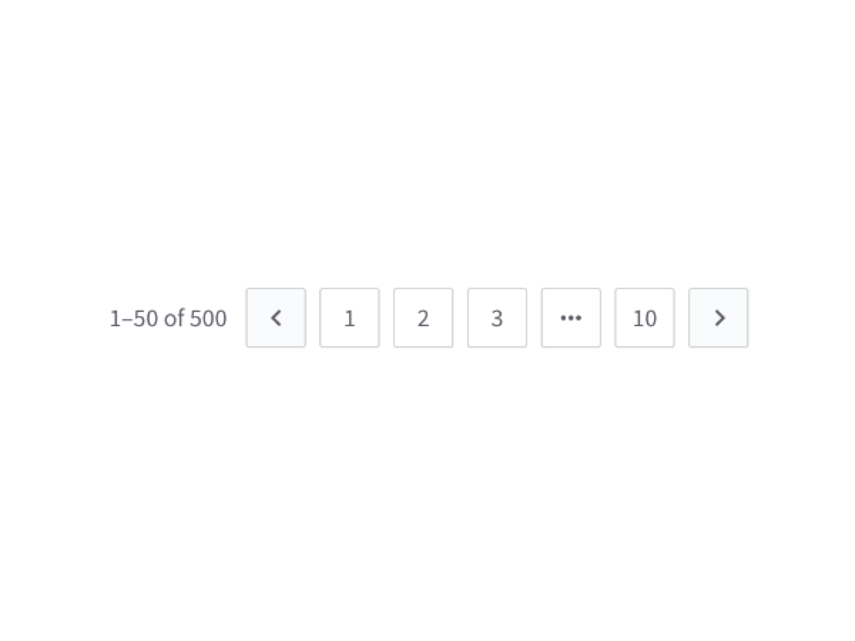
Pagination
Pagination is a form of navigation that is used to move across 2 or more pages of related content.
Panels
Panels display content of many or few elements that vary in both size and action. They are used to create structure and clearly delineate sections of content. Panels may contain photos, text, links, forms and buttons.
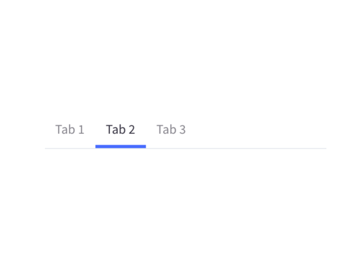
Tabs
Tabs allows you to navigate between multiple documents in a single window. Instead of a single title bar, a tabbed window may include multiple tabs along the top. Clicking one of the tabs will display the contents of the corresponding document.
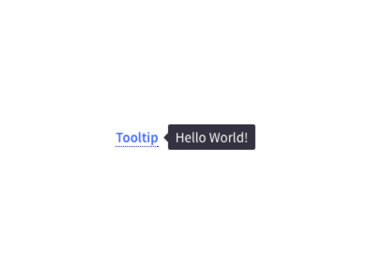
Tooltips
Tooltips are small items of information which are displayed in the context of an item that needs further explanation.
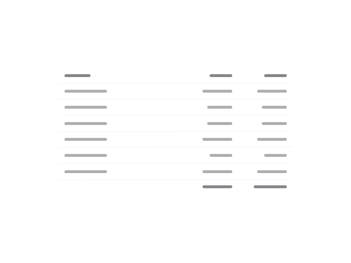
Tables
A basic table is a data structure that organizes information into rows and columns. It can be used to both store and display data in a structured format. For example, databases store data in tables so that information can be quickly accessed from specific rows.
Toast
Success confirmation appears when user creates and completes a task successfully at the top of the page.