Data Tables
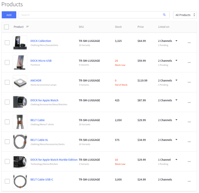
A data table is composed of at least two column headers row and at least one data row (and occasionally a column footer). It is used to organize large volumes of data.
Subcomponents

Usage:
The Data table uses a combination of the table component, pagination, and a filter to organise data and enable filtration and navigation of large datasets. It should be used in interactive tables with possibly large amounts of rows; like Orders or Products.
Usage:
The Data table uses a combination of the table component, pagination, and a filter to organise data and enable filtration and navigation of large datasets. It should be used in interactive tables with possibly large amounts of rows; like Orders or Products.
Empty Treatment

Usage:
When there isn’t any content to display in a table, an empty treatment should be used to provide users with contextual information. An Illustration is optional, and should be sized at a maximum height of 40px, or maximum width of 200px. The empty treatment may also have a maximum of one link or button. This should help the user to populate the data table, either through education (via a knowledgebase article), or direct action (Create a Product).
Usage:
As an empty table has no content, the table doesn't require a thead. There is only one tr which contains one td,
which is the .emptyTable component.
CSS Classes:
1. .emptyTable
- The component's container class. Should be applied to the only
tdin the table.
2. .emptyTable-image
- Applied to an optional illustration that may be used to enhance the message.
- Maximum image width is 200px; Maximum image height is 40px.
3. .emptyTable-title and .emptyTable-description
- The default classes for the title and description of the message, respectively. Styled to default text styles.
.emptyTable-titleis expected to be astrong,.emptyTable-descriptionis expected to be ap.
4. .emptyTable-action
- The only action allowed for this message. Should aid user in populating table.
- Expected to be applied to
a.